NextCrew: two years as the sole designer of a staffing operating system

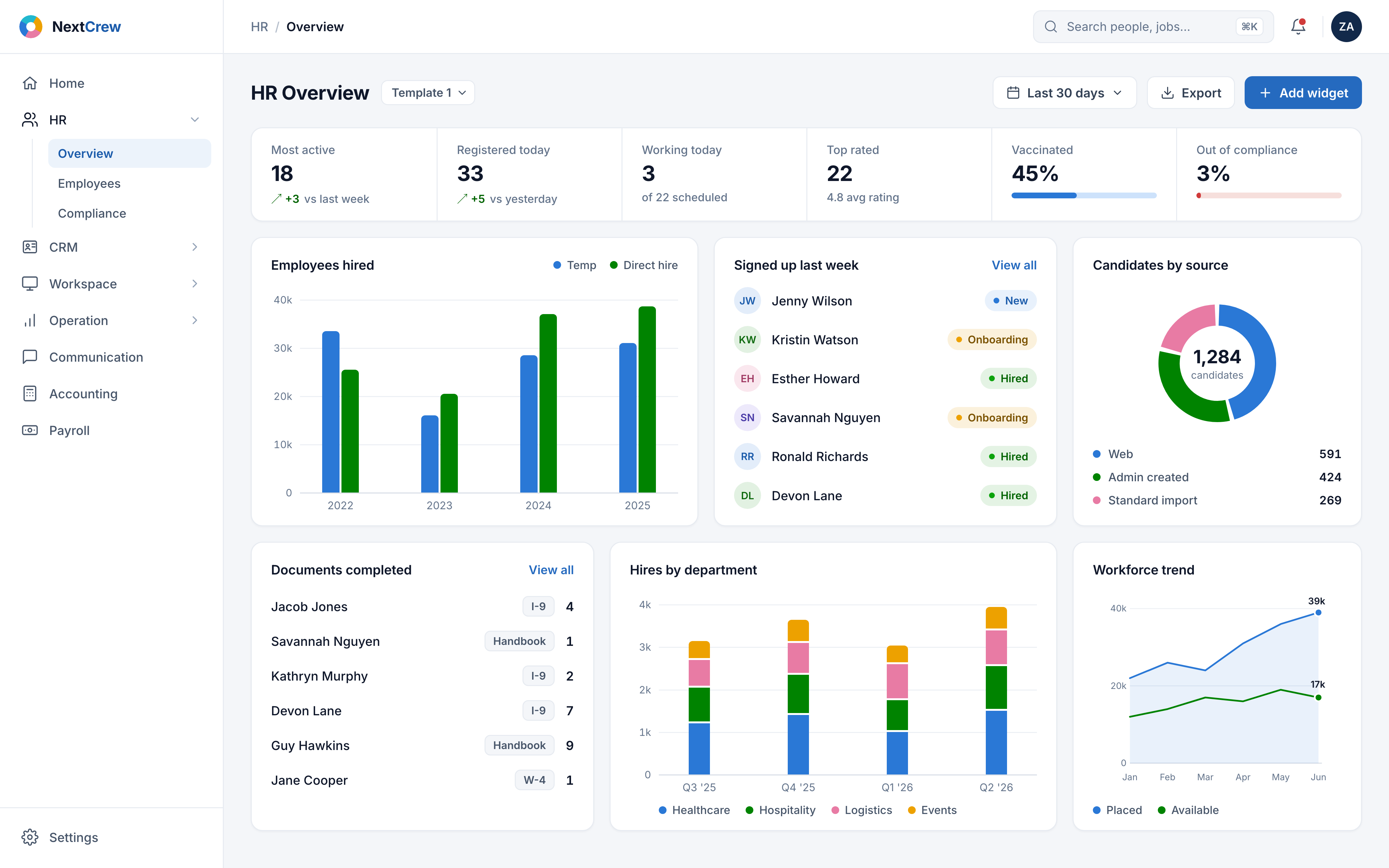
This is a rough redesign concept with very limited functionality, built for presentation purposes - not the production platform.
Two years inside one product

The quick company picture, so the design decisions below have context.
The two years, in one drag
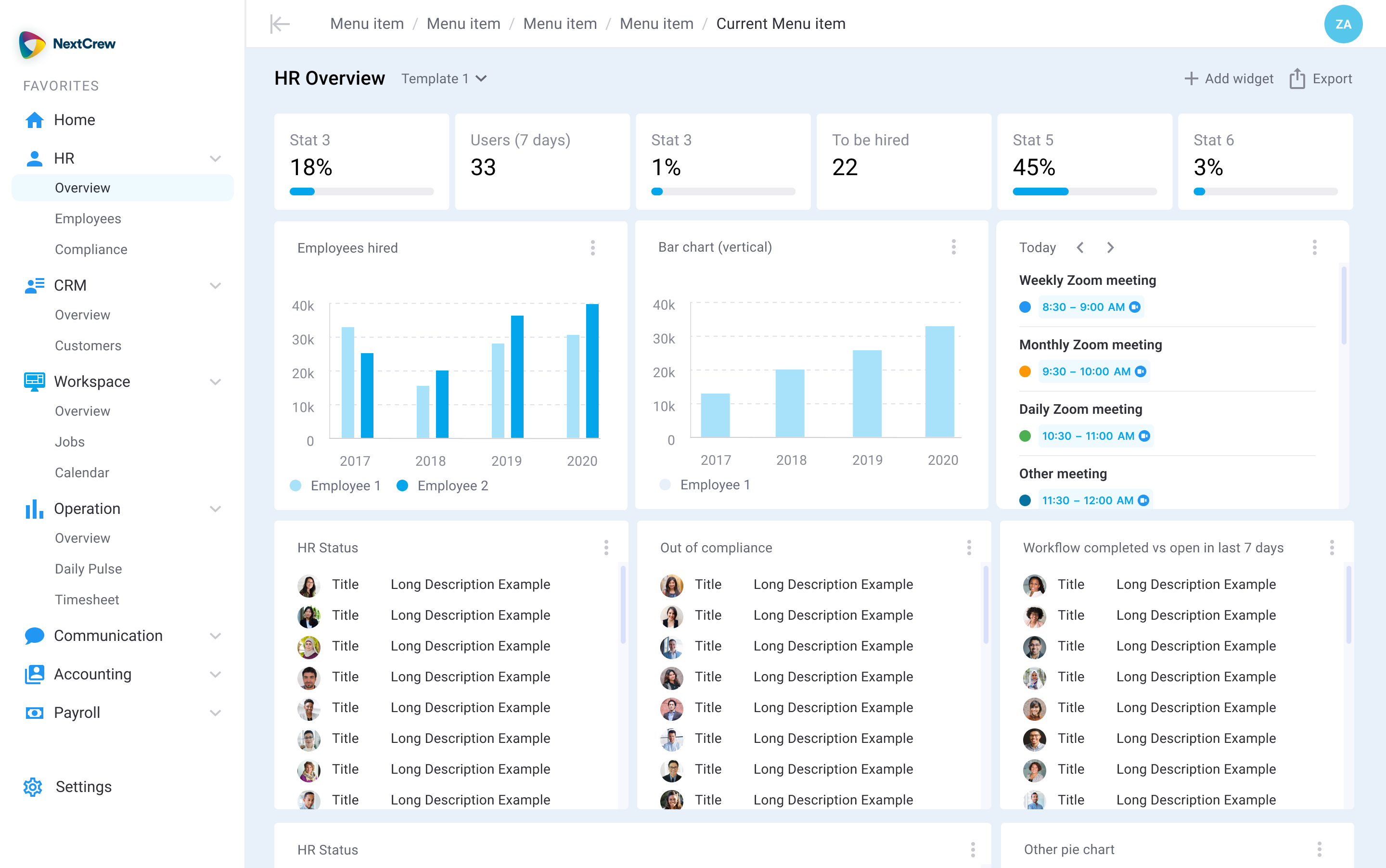
Pull the handle left and right to wipe between this exact screen at its 2023 design stage and my 2026 revisit - the full story of both is below. Arrow keys work too.
 2023 · This screen, then
2026 · Redesign
2023 · This screen, then
2026 · Redesign
Three audiences, one operating system
NextCrew is a Chicago-based staffing operating system, founded in 2012, running agencies end to end - recruiting to invoicing, plus a white-label offering, across North America and Europe. A staffing agency is a promise factory: tonight's banquet needs servers, tomorrow's ward needs nurses. NextCrew's platform keeps those promises for three audiences at once:
Agency staff
Owners, ops coordinators, recruiters, finance. They live in dashboards, schedules, timesheet approvals, and compliance lists all day.
Crew members
The workers themselves - mobile-first, often between two jobs, onboarding, picking up shifts, and clocking in from a phone.
Client companies
Hotels, clinics, warehouses. They post jobs, review candidates, and approve timesheets through a self-service portal.
Six verticals
Healthcare, industrial, hospitality, events, experiential marketing, education - each with its own compliance and scheduling pain.
Two layers of "before"
By the time I joined, the platform had two pasts. First came the obsolete system agencies had been running on for years - built long before any designer touched the product. Then came the revamp attempt: a junior designer, hired before me, producing modernized screens one at a time. Both layers are below, unretouched and in chronological order - because the "after" only means something if the "before" was real.
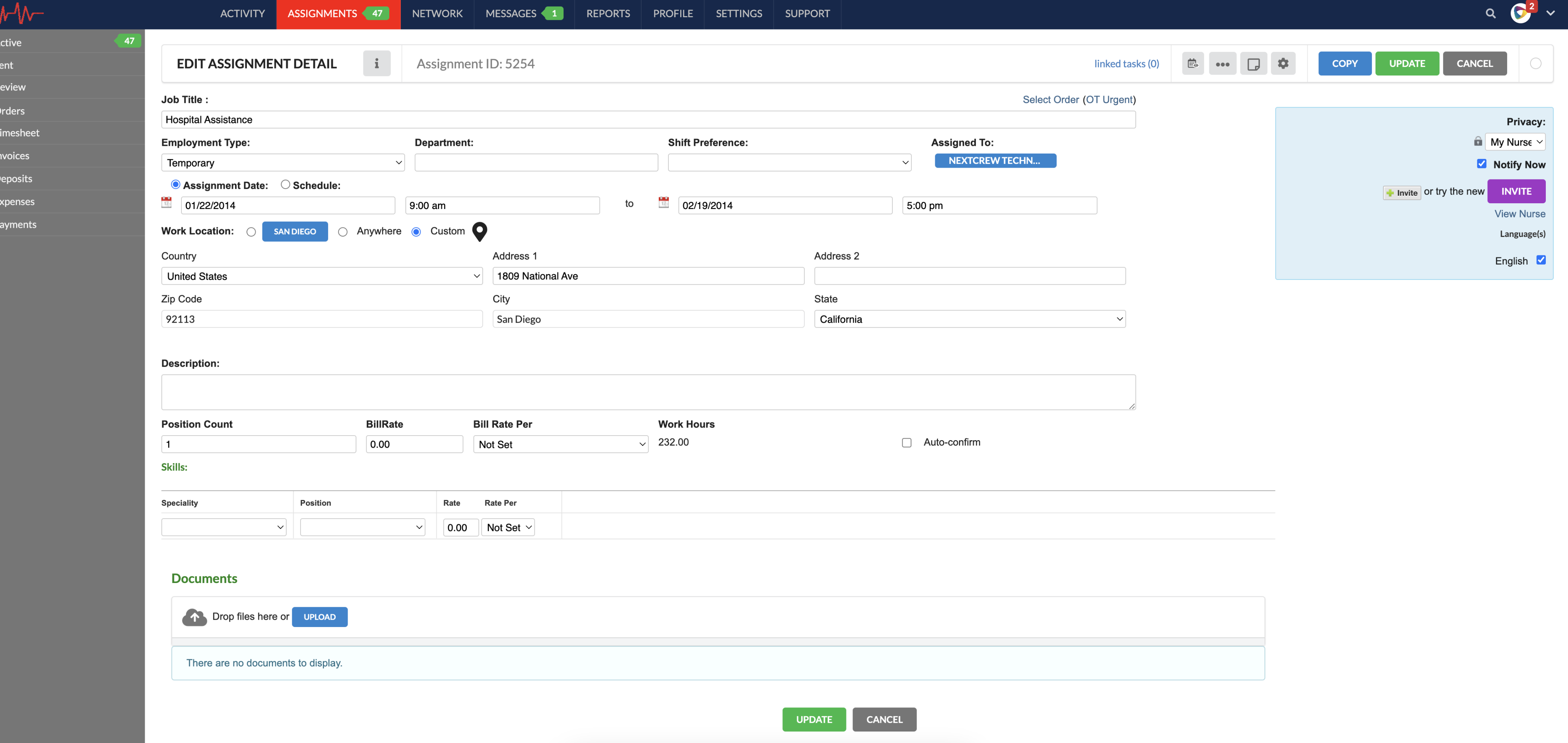
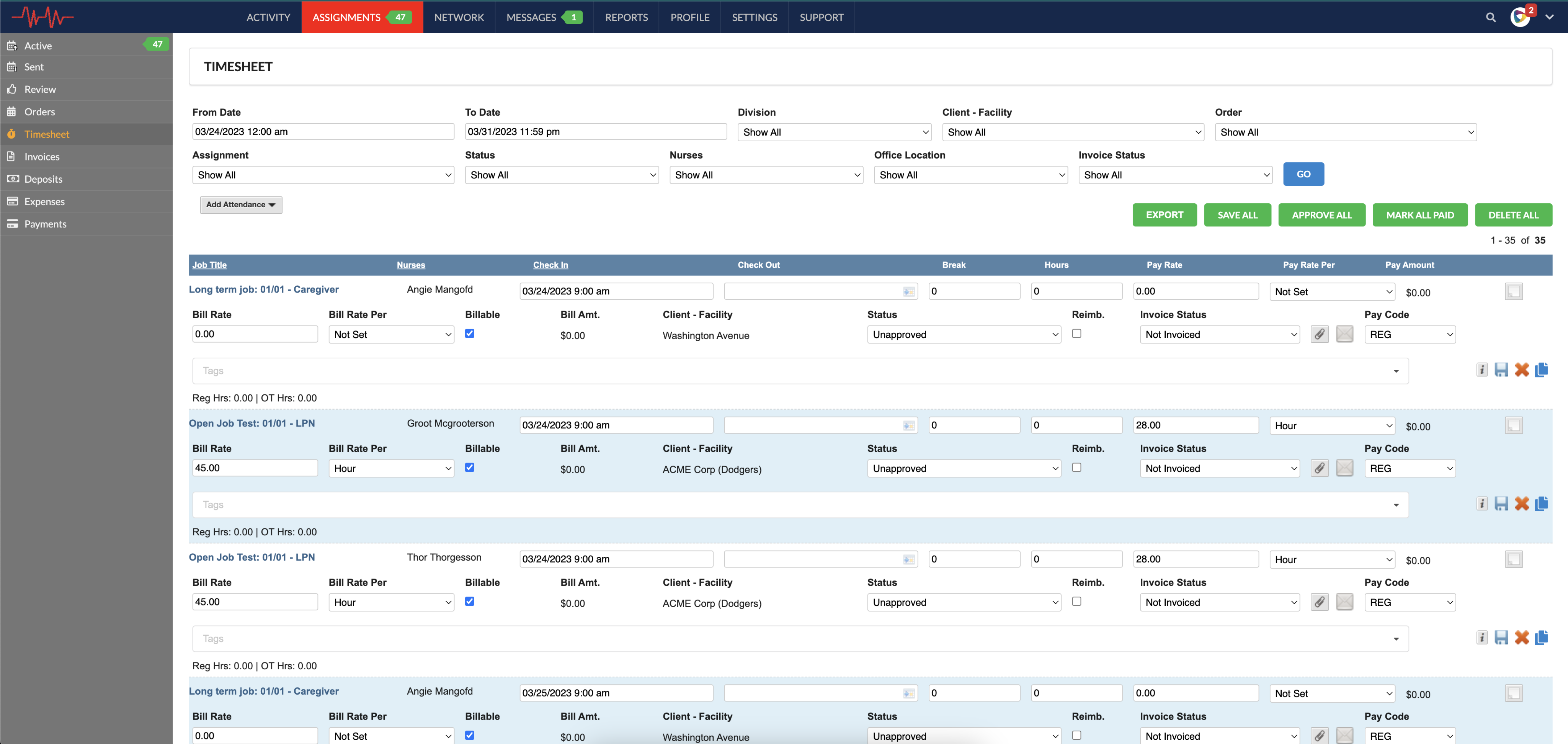
Layer one: the obsolete system
The legacy product itself - the screens agency staff lived in every day before the redesign effort began:
Layer two: the junior designer's revamp
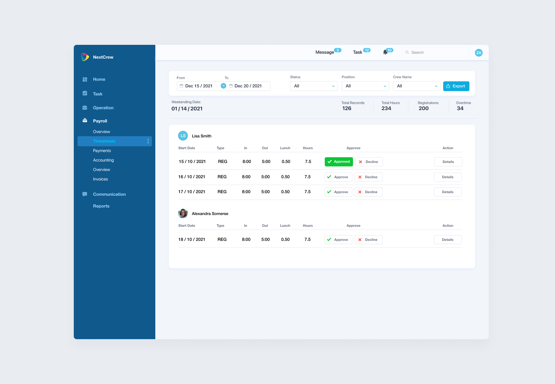
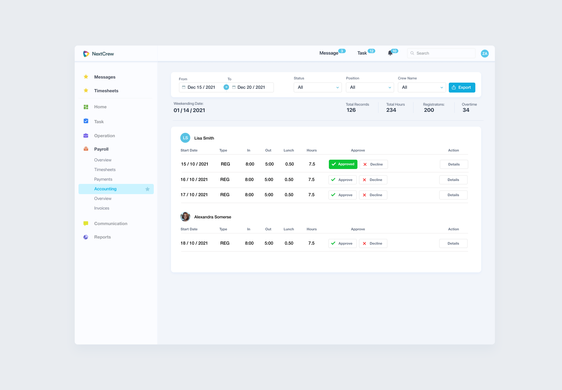
To modernize that system, NextCrew first hired a junior designer. The Figma files from that era are honest about how it went: the same timesheets screen exists in three different navigation treatments, "Overview" appears twice in one sidebar, and the KPI labels ship with typos - "Total Recorrds", "Registratons". None of that is a criticism of one person. It is what happens when nobody owns the whole.
What I actually did for two years
Built and led the design system
Tokens, components, patterns, and the documentation that let a remote dev team build consistent screens without me in the room. One navigation model instead of three; one table anatomy; status colors that mean the same thing everywhere.
Designed through the enterprise repositioning
Enterprise buyers demo the product before they trust it, so the interface became a sales argument: denser data, role-based dashboards, audit-friendly flows, white-label readiness.
Redesigned the operational core
Recruiting and onboarding, job management and scheduling, timesheet approval, payroll and invoicing, reporting - the daily-bread screens where agency staff spend their working lives.
Owned the whole design loop
Discovery, scope definition, prototyping, annotation, handoff, iteration - across multiple product cycles, as the only designer in the company.
How components reached the developers: the slot approach
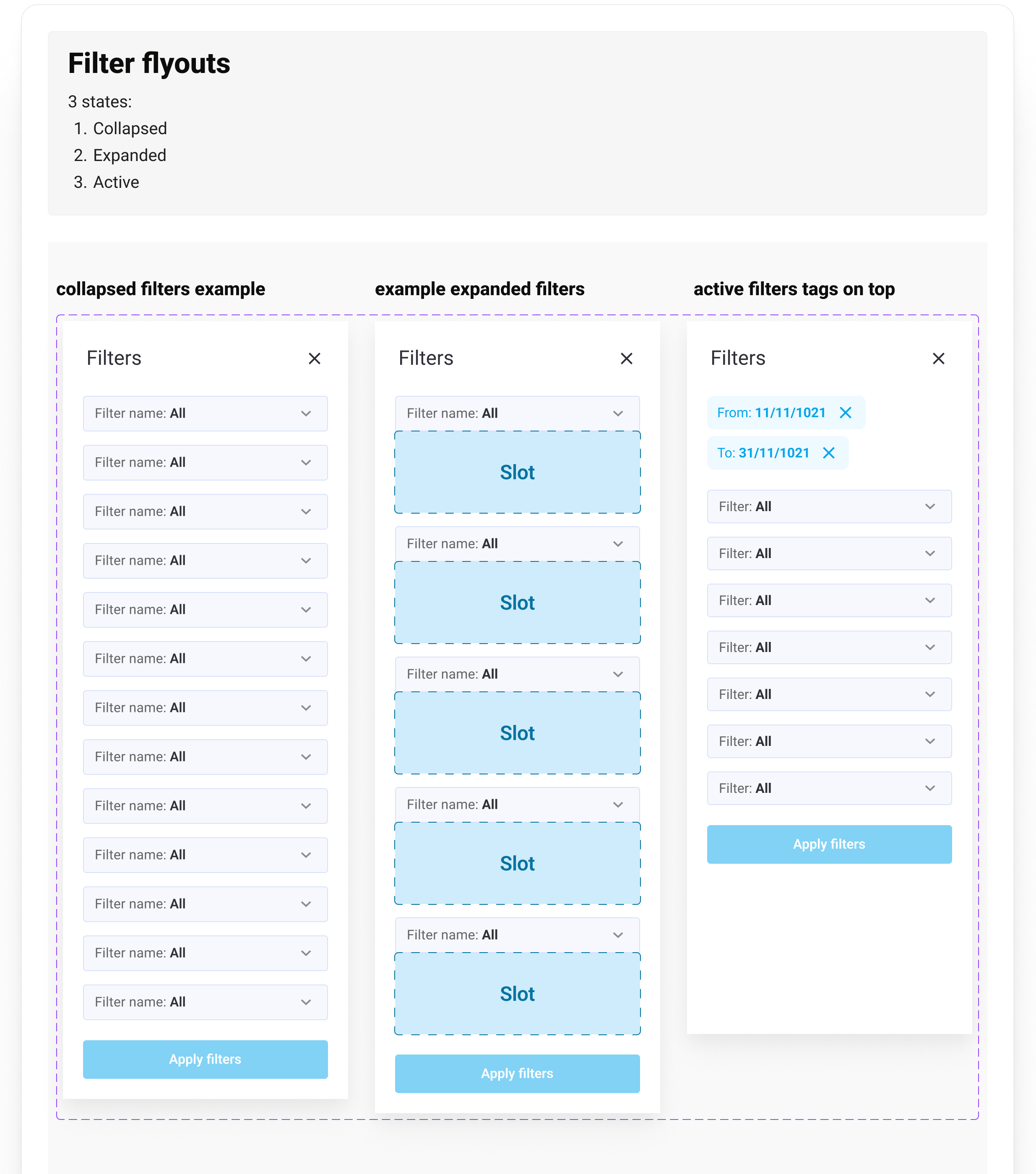
With a remote dev team building overnight, the system had to communicate composition, not just looks. Each component exposes slots - placeholder regions where any approved content can drop in, so one filter flyout serves every module. The handoff sheet reads like an API contract: here are the states, here is the slot, here is what may go inside.
Annotations developers can build from
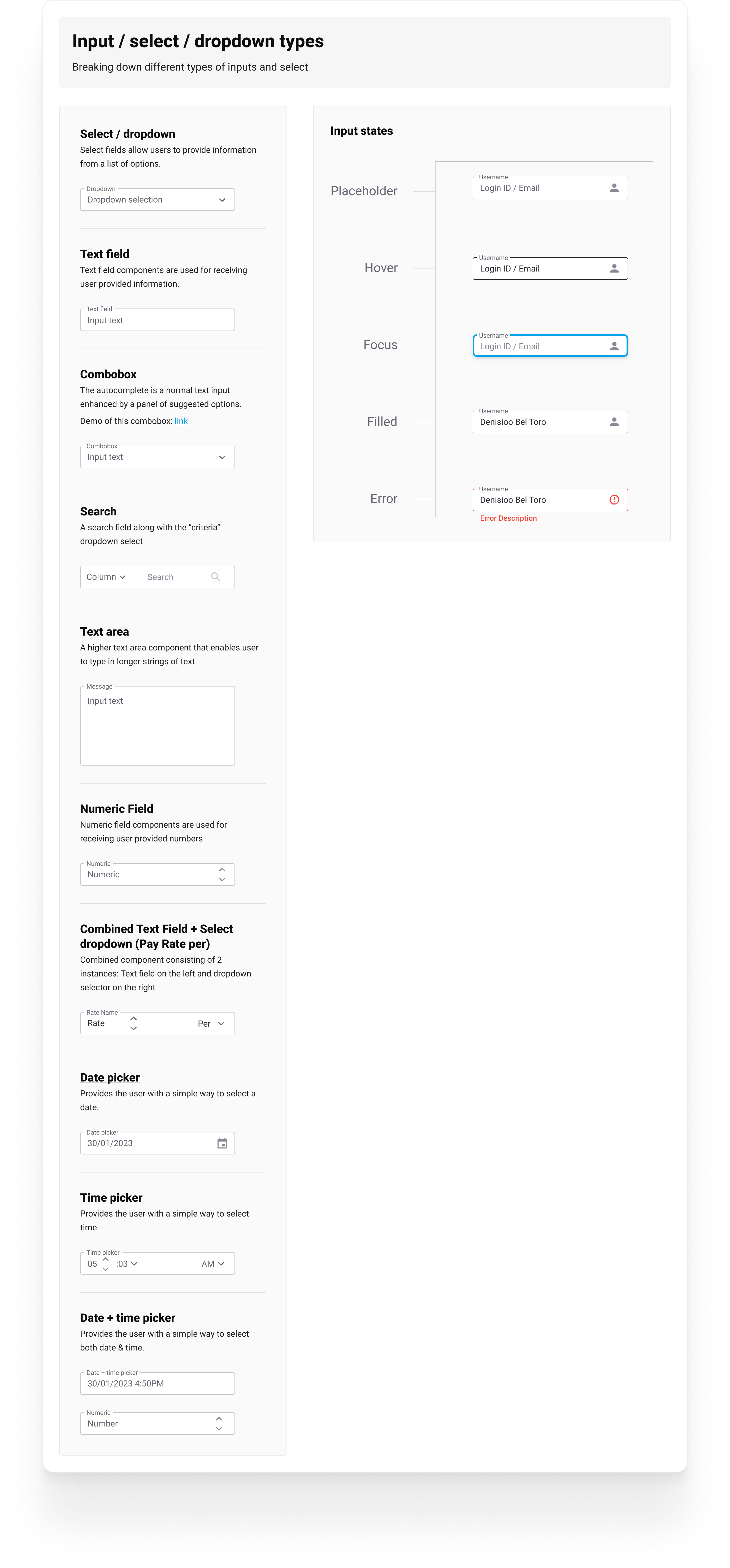
The other half of handoff is annotation. Every component family ships as a documented sheet: the taxonomy of variants, then every state drawn out - placeholder, hover, focus, filled, error - so nothing is left to a developer's guess at 2 am my time. Notes speak the developers' language, down to their component library: when the team built on MudBlazor, the specs referenced MudBlazor's own standards instead of fighting them.
Height
The height of input fields and buttons is 42px.
This aligns well with the MudBlazor standard components' height.
A dev note from the system, verbatim. The 42px is not taste - it is the number that lets designed components and the team's MudBlazor stock components sit in one row without seams. Annotation earns trust when it shows the designer read the developers' documentation too.
Reading the market first
Design in this category does not happen in a vacuum: an ops coordinator who spends the day in NextCrew has usually seen a Bullhorn demo, and every enterprise deal is a comparison. The benchmark that matters most is not the marketing - it is how each platform and its app actually look and behave. Product UI first, positioning second. Captures from the July 2026 pass for the revisit below.
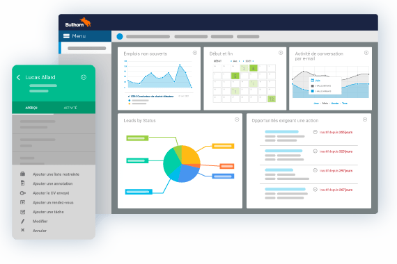
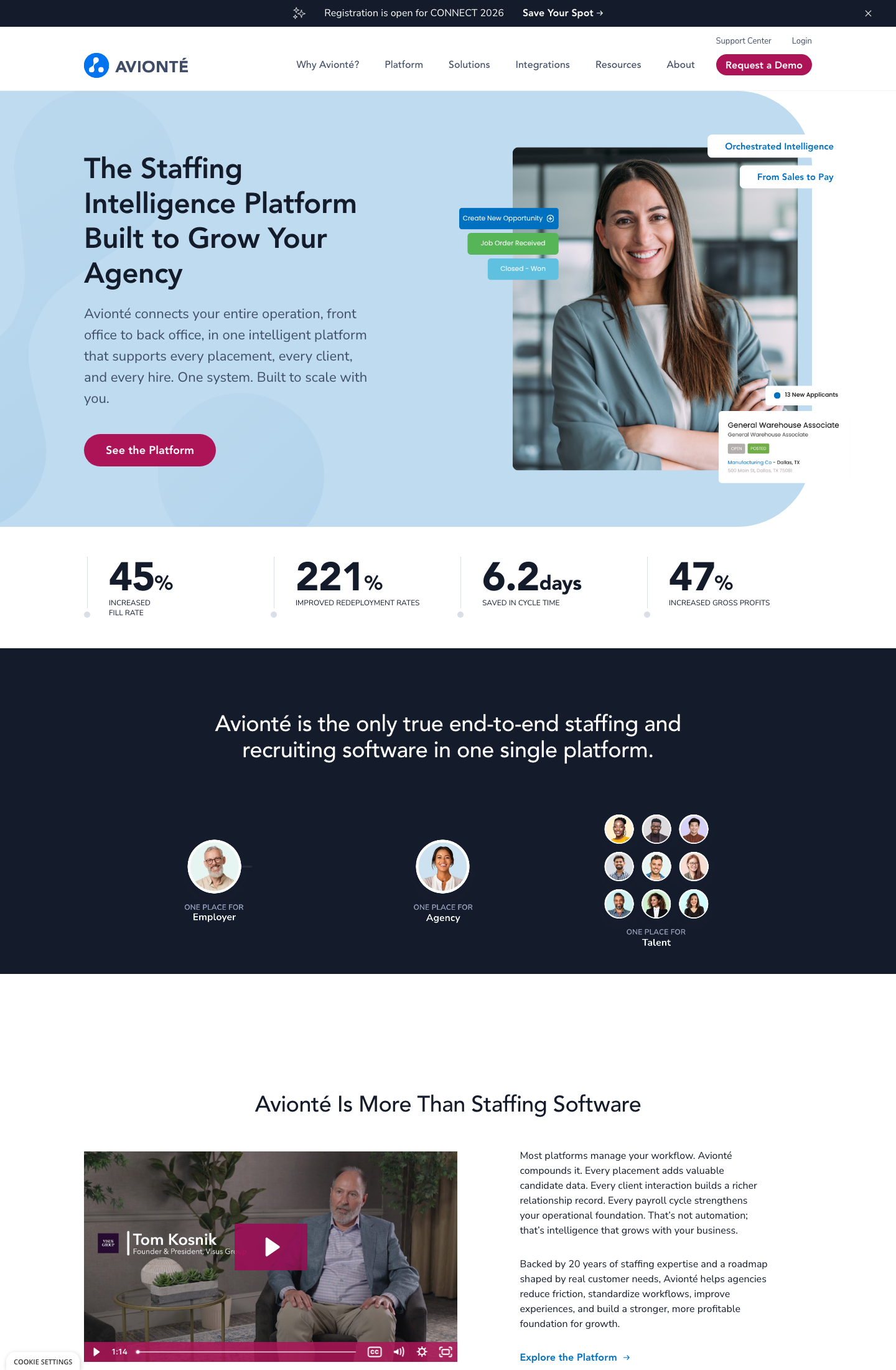
The recruiting-first giant. Dense multi-widget dashboard, muted chrome, a different color per widget. Powerful, but the palette carries no consistent meaning - the exact trap the NextCrew redesign avoids with one validated chart language.
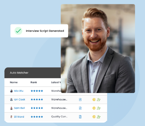
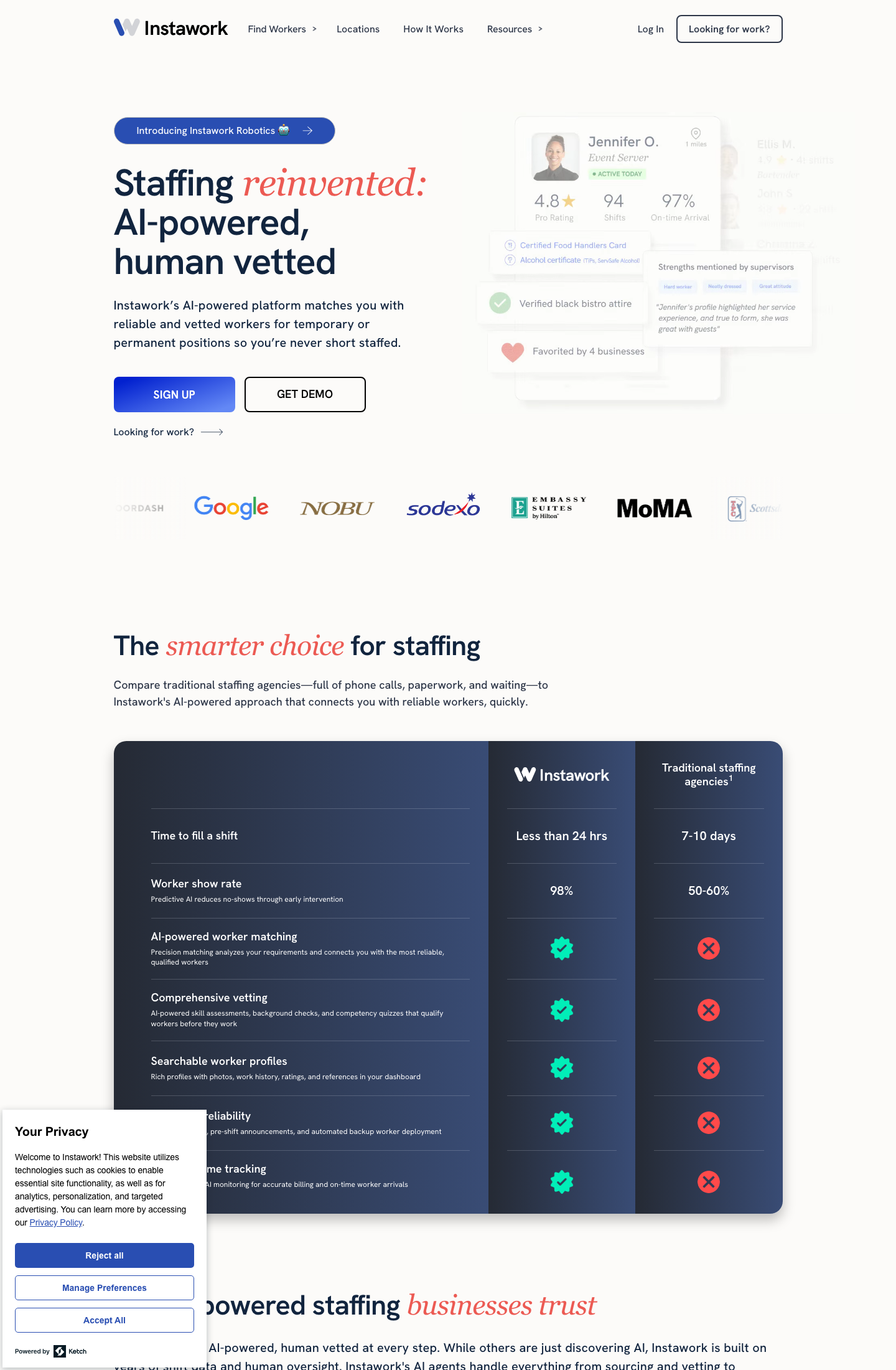
The closest positioning twin ("fewer systems, stronger staffing"). Their Auto Matcher ranks candidates in a plain, legible table with star ratings - AI presented as an ordinary list, not a black box. Quiet confidence worth copying.
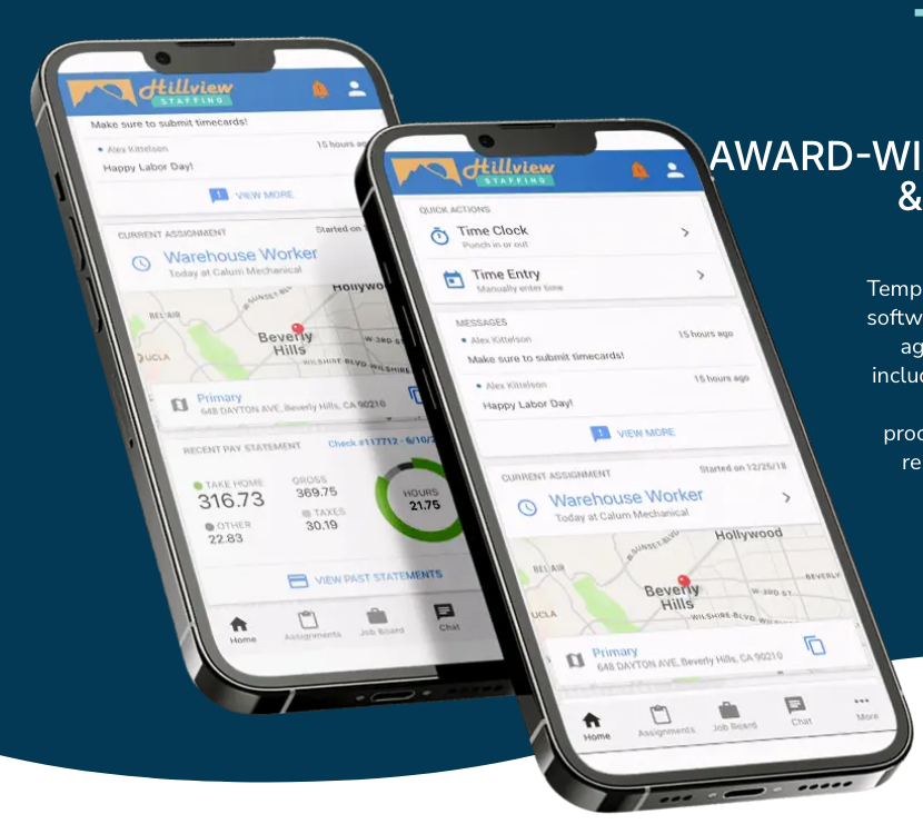
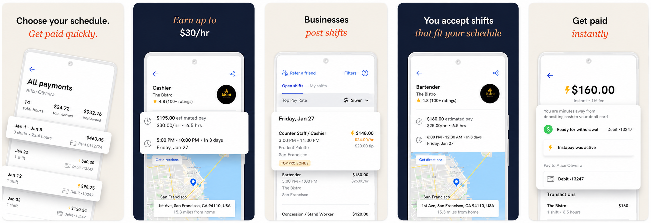
A 25-year temp-staffing veteran that leads with the worker's phone: assignment with a map, time clock, pay statement with a take-home breakdown. In this category the crew member's app is the product's public face - the same reason NextCrew's mobile experience carried so much design weight.
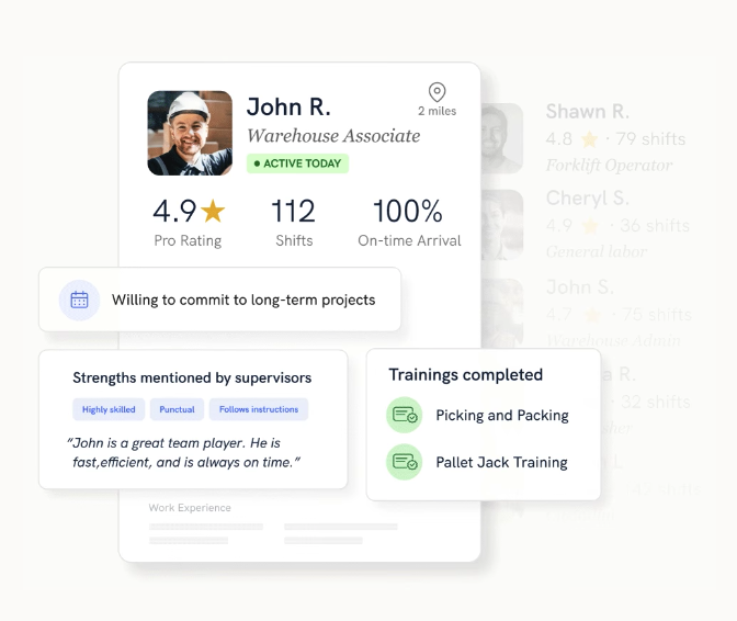
The marketplace disruptor selling against agencies. Its best pattern: the worker trust card - rating, shift count, on-time percentage, credential chips ("Certified Food Handlers Card"). Compliance rendered as a selling surface. This thinking directly shaped the worker-profile and compliance panels in my revisit.
What the benchmark taught the redesign
Outcomes are the interface's language
Avionté and Instawork lead with operational numbers - fill rate, cycle time, show rate. A staffing dashboard should speak the same way: deltas, denominators, drill-downs.
Three sides, one clarity contest
Everyone serves agency, worker, and client. The winner is whoever makes each side's next action most obvious - not whoever lists the most modules.
Credentials are trust UI
Instawork renders compliance as badges on a worker's profile, not paperwork in a drawer. That shaped the compliance and worker-profile panels in the revisit.
The worker's phone is the brand
TempWorks puts the crew app first. In this category mobile is not a companion - it is where half the users live, at 11 pm, after a shift.
The inspiration wall
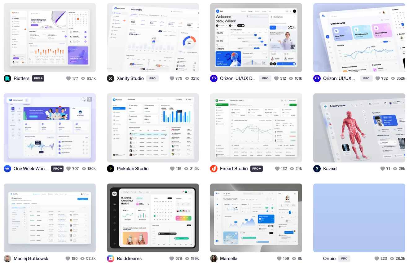
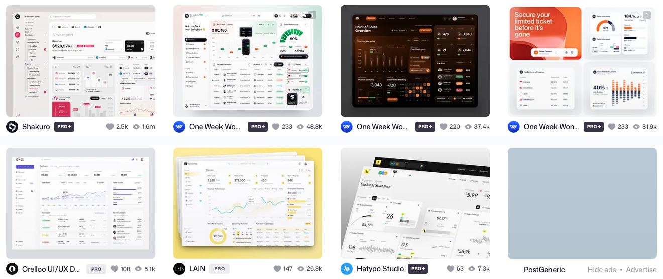
Good dashboard thinking is not exclusive to staffing. Alongside the direct competitors I collect patterns from adjacent categories - medical dashboards (NextCrew's biggest vertical is healthcare staffing) and sales analytics (the same glance-inspect-act reading rhythm). I also browse Dribbble and Behance broadly - creative patterns, widgets, tables, filter designs - since that's often where a genuinely new idea surfaces before any competitor ships it.
Three people, three definitions of a good day
Every screen in the platform answers to one of these three. On the agency side the buyer varies - CEO, COO, recruiter, CFO - but the person living in the interface all day is the coordinator, so that is who the operational screens are tuned for.
The ops coordinator
"My phone starts at 6 am. If a shift is uncovered, I hear about it before my coffee does."
- Today's coverage visible in one glance, not twelve widgets
- The fastest path from open shift to available, compliant worker
- Bulk actions - approving a week of timesheets is a task, not an hour
- Reports the owner and the CFO will accept without a meeting
The crew member
"I work two jobs. If clocking in takes more than a minute, something is wrong with the app, not with me."
- Shift offers they can accept in one tap, between other things
- Where, when, and who to report to - on one card with a map
- Pay transparency: hours, take-home, and status without asking
- Documents and credentials handled entirely from a phone
The client manager
"I don't care how staffing software works. I care that Friday's crew shows up."
- Posting a staffing need in minutes, without a phone call
- Seeing vetted candidates with ratings and reliability signals
- Approving timesheets in bulk from the portal, not by email
- Confidence: fill status and no-show risk visible before Friday
What these screens were hired to do
I noticed this watching coordinators care about exactly one thing - was today covered - and nothing about my navigation model. A screen isn't a feature list, it's a job someone hired the software to do; nobody buys a drill because they want a drill. At NextCrew that question became my tiebreaker whenever a debate had no data. Four of those jobs, in the words I kept hearing:
Maps, job stories, and real tests
Three tools carried two years of solo design decisions. Customer journey maps turned each audience's experience into a sequence I could design against - one map per journey: the crew member's arc from application to paycheck, the coordinator's from job order to invoice, the client company's from posting a job to approving timesheets. The jobs-to-be-done above were not a slide for this case study - they were the working method: every flow started as a job story, and when a debate had no data, the job statement was the tiebreaker.
Job stories
Every flow started in job-story grammar - when, I want, so I can - before any screen existed. The format forced cause and effect into the open and kept a one-person design practice consistent across three audiences and six verticals.
Real tests
Research ran on three channels: interviews with the managers and agencies the repositioning targeted, moderated usability tests on real tasks (fill a shift, approve timesheets, chase a credential), and demo recordings reviewed between releases. Several screens changed because someone hesitated on camera.
The crew member's journey
The crew member is the person the whole platform ultimately answers to. Here is their full arc in five steps - from first application to getting paid - each tied to the job they needed done and the design answer that solved it.
Apply & onboard
Get matched
Work the shift
Get paid
Stay eligible
From grayscale to pixels
Every screen goes through the same honesty test before it earns color: if the dashboard reads in grayscale, the hierarchy is real; color is then allowed to mean something instead of decorating.
The constraints that shaped the work
Live agencies, an enterprise sales motion, a remote dev team, and no design team to check my own thinking against - four constraints that shaped every decision across the two years.
Redesigning a plane that was already flying
Agencies ran daily operations on the platform while it was being redesigned. No big-bang launches - fix the foundations, then migrate screens one release at a time without breaking anyone's Tuesday.
Enterprise expectations on an SMB codebase
Enterprise buyers judged screens originally designed for five-person agencies. Their bar - dense data, role-based views, audit trails - had to be met without a rewrite. Design carried a large share of that gap.
Handoff across an ocean
A remote development team, hours apart, building from my files while I slept. Annotation discipline, redlines, and edge-case documentation stopped being nice-to-haves and became the difference between shipped and misbuilt.
No design team to argue with
Sole designer means no critique partner. I built the feedback loop from what existed: support tickets, sales-demo recordings, and founders' objections became my design review. The product told me where it hurt.
What two years of design bought
Coming back to the HR Overview
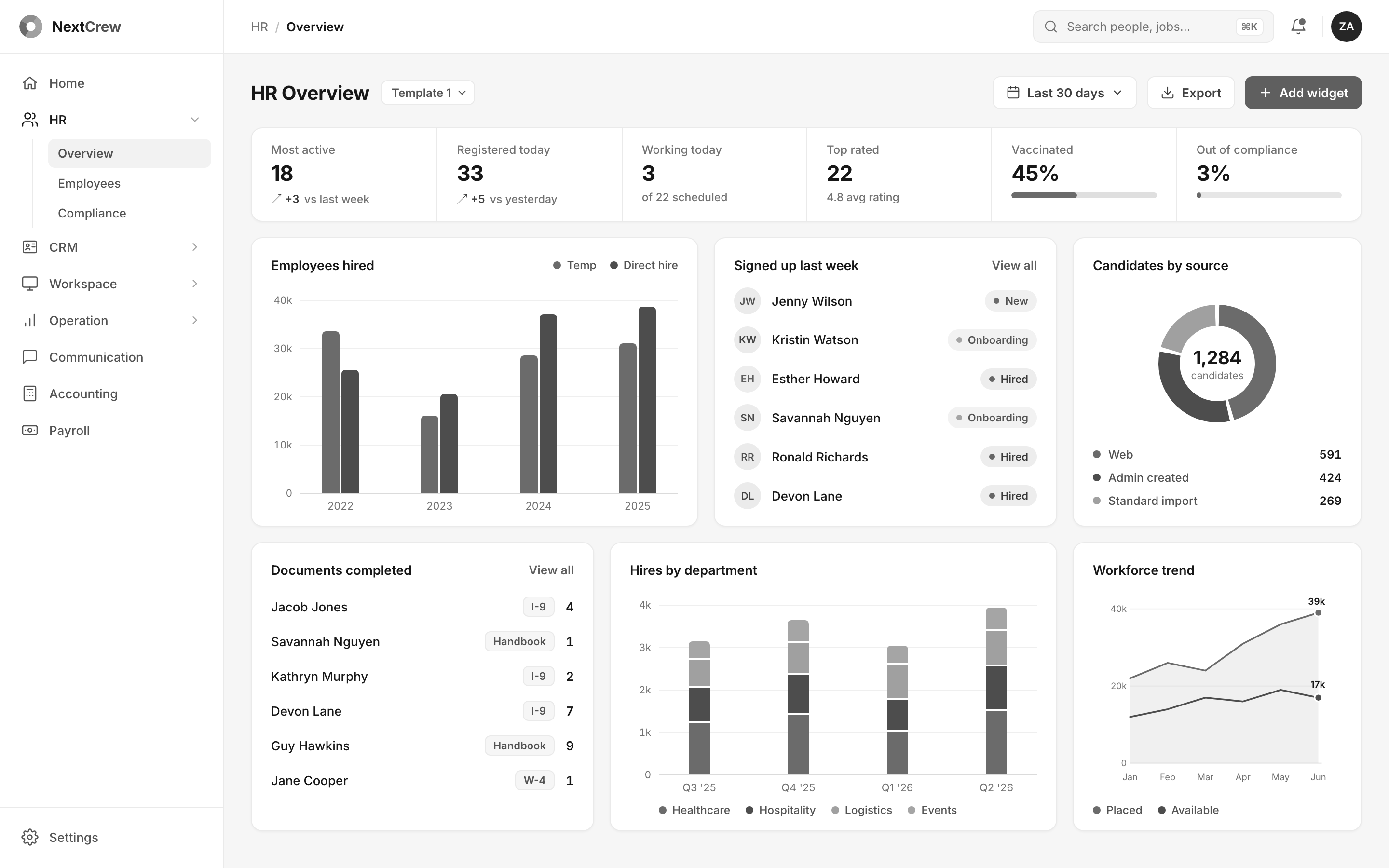
In July 2026 I took one screen from the platform's older era - the HR Overview dashboard - and rebuilt it the way I would ship it today: one validated chart palette, KPIs with deltas and drill-down panels, worker profiles one click away, live date-range filtering. Not a static picture - a working prototype with real interaction logic.
2023 · This screen, then
2026 · Redesign
Pull the handle to compare - the same wipe as before, one more time.
Fully volunteer work of mine this year, revamping the platform with the expertise I've grown since and building and prototyping it with AI. Still rough and untested on real users - this is just my own time.
The 2026 redesign, widget by widget
Hover over any rectangle to read what the widget does and which job it serves.
Role-based navigation. Modules grouped by function, current section expanded, one visual treatment everywhere.Serves: "help me orient in seconds"
Global controls. Date range scopes the whole board at once; export and add-widget sit where reporting starts.Serves: "prove growth to my boss"
KPI band with consequences. Six numbers with deltas and meters - the risk metrics open action panels with the affected workers and a reminder button.Serves: "is today staffed - and will anything cost us?"
Employees hired. Temp versus direct hire by year in one validated palette; every bar drills into share, trend, and the worker list.Serves: "is the pipeline refilling?"
Signed up last week. Newest workers with status pills; one click opens the full profile with documents and shifts.Serves: "is onboarding moving?"
Candidates by source. Which channel fills the funnel - segments isolate on click, counts stay honest to the period.Serves: "where should acquisition effort go?"
Documents completed. Who finished what, document type and count in tight pairs - the compliance trail at a glance.Serves: "keep us out of compliance trouble"
Hires by department. Stacked quarters across the verticals; each segment drills into share and quarter-over-quarter change.Serves: "which vertical is growing?"
Workforce trend. Placed versus available over six months, tracking dots on hover - capacity against demand in one glance.Serves: "can we cover next month's promises?"
How I show interactions: then and now
Then (2022)
- Research and discovery started the same way - but without AI, that phase alone took weeks to months
- Found existing products that already nailed the interaction, recorded screencasts as the reference
- Design happened by hand in Figma, pushing pixels screen by screen - the slowest part of the process
- Shared with the client and developers as the single source of truth for the interaction
Now (2026)
- Start from research, benchmarking, and jobs-to-be-done - interviews, analysis, and usability testing first
- The thinking and creative work still happen outside AI - tools like Claude Code and ChatGPT take over the routine, time-consuming parts
- Still open Figma, but rarely now, mostly for custom changes and shipped-quality polish
- About 5x faster end to end - the same working prototype now takes days to weeks, not months
"Nobody notices software when a shift gets covered. They only notice the one that didn't. I built NextCrew a system designed to stay invisible - and by every account, it still is."
Igor Šalagin
The contract ended. The system didn't.
The engagement ran 2022-2024. NextCrew wanted to bring the role in-house next - a designer in Chicago, in the office, owning the whole design system going forward. My plan was to keep living in Estonia, so I declined politely and handed the founder and team the full design system, the interactions, and a set of ready design scenarios, built for handoff. Today I design brands, products, and websites for founder-led businesses, and NextCrew remains the deepest single product engagement of my career so far.